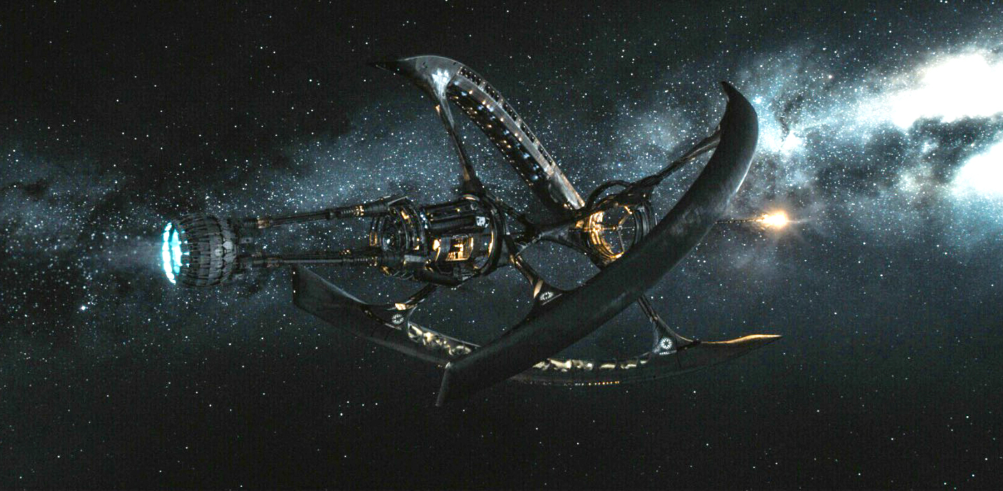
The big-budget sci-fi thriller "Passengers," opening Dec. 21, 2016, promises a vision of space travel that is grand but also a bit frightening — and, surprisingly, somewhat akin to a certain spooky resort in the Colorado Rockies. More about that later.
"Passengers" is set in a large interstellar starship, cruising between Earth and a nearby star system. The human cargo is in deep sleep, some 1,500 of them, during the 120-year journey to their destination. At least they are supposed to be.
Unfortunately for two of these "passengers," they are awakened just a bit early — 90 years early, to be exact. And they must discover what has gone wrong, or die long before they arrive. [Strange Cinema: Space.com's Favorite Off-Beat Space Movies]

The pre-release clips and stills — you have doubtless seen the trailers — show a movie that is epic in scale. Designing an enormous hibernation starship crossing the vast and empty reaches of interstellar space created a compelling challenge for the production team. It's one thing to design any starship after more than a century of science fiction movies set in space (Georges Méliès' "A Trip to the Moon"was produced in 1902); add to that an interior that resembles less the International Space Station and more the Mall of America, and you have one huge production design project.
Guy Hendrix Dyas, the film's production designer, was responsible for the overall visual look of "Passengers." He has worked in the film industry for decades, including stints at special effects powerhouse Industrial Light and Magic and as an artistic designer on "Matrix Reloaded," "Inception" and "Indiana Jones and the Kingdom of the Crystal Skull." Space.com sat down with Dyas for a conversation about the spacecraft and the richly designed spaces within.
Space.com: How did you come up with the design of the ship, given the long history of starships in science fiction and the hugely influential designs of the "Star Trek" and "Star Wars" ships?
Guy Hendrix Dyas: I'd done illustration work for a lot for great production designers on other science fiction films, but I'd never been at the helm of one of these projects myself. I thought, "Wow, that would be fun, designing a spaceship, that's great!" Then a wave of horror washed over me, in that I was up against a pantheon of spaceships that have been designed from the 1960s through the 1980s, that are icons. Everything from the ["Star Trek"] starship "Enterprise," probably the most famous of them all, to the Millennium Falcon [from "Star Wars"]; it goes on and on.
Get the Space.com Newsletter
Breaking space news, the latest updates on rocket launches, skywatching events and more!
I immersed myself into the legacy of spaceship design and made a huge roll-out scroll of 11-by-7-inch printouts, all stuck together to make it 80 feet long. It was a full history of spacecraft in cinema that started with Georges Méliès' "A Trip to the Moon" and went all the way up through "The Martian" (2015), which had just come out when we were building our sets. So I used this as a bible of good — and bad —designs, and why we should be focusing our design strengths in certain directions. [Gallery: Visions of Interstellar Starship Travel]
Space.com: So what was your ultimate inspiration for the ship?
Dyas: I came up with a concept that had caught the imagination of the director based, quite simply, on looking at the seeds of sycamore trees and watching how they fell in a rotary fashion, like little helicopters. I just happened to see one of these things fall from a tree near where I was staying. That was a core inspiration.
Space.com: So what intrigued you most about the script for "Passengers"?
Dyas:When I flew into LA to meet the director and read the script, I was completely blown away by it. At this point in time, where nothing can be realized unless it's a franchise or a superhero, here's this script that just took my breath away. It's a relationship film set in space, it was heady and smart, it was clever, and had obvious aspirations towards being something that could straddle the bridge between scientific science fiction and thoughtful science fiction, in the same way that "Interstellar" or "The Martian" did.
It also harkened back to the classic films I loved growing up … movies like "Silent Running" with Bruce Dern, a forgotten classic that is still, in my opinion, one of the cornerstones of great science fiction, that really explored the idea of loneliness in space. I realized that if we were going to have a film about two characters in deep space who have woken up early and are destined to live out the rest of their lives on this ship, I needed to come up with a design that had some scientific validity to it.
Space.com: Can you tell us more about what drove the shape of the ship? It's a very unique design.
Dyas: This is not merely a spacecraft from which they looked through the portholes and into the ether. I wanted them to be able to look across the ship at other components, other parts of the ship. This is a relationship film; at one point these two people aren't even speaking to each other, and I wanted one of them to be in one hull, looking a thousand feet away to the other character in another hull, while they are spinning out of control.
Space.com: It is refreshing to see a starship design that addresses the problem of long-term weightlessness.
Dyas: Yes, and this idea of kinetic movement to create artificial gravity had been well explored beginning with Stanley Kubrick's "2001: A Space Odyssey." We can't just have a "gravity button" anymore — the audiences are too sophisticated. The days of having people just running around in space, without having to explain how we create gravity, are over. I think we get a free pass on "Star Trek" and "Star Wars."… But if you're trying to create something new that might appeal to a more sophisticated audience, you have to pay some respect to science. So my original sketches for the ship reflected that. Instead of creating a singular lump in space, I designed a space frame that held three outer hulls and a central hull that contained the propulsion unit. This separates the humans from a potential nuclear hazard.

Space.com: What about the interiors?
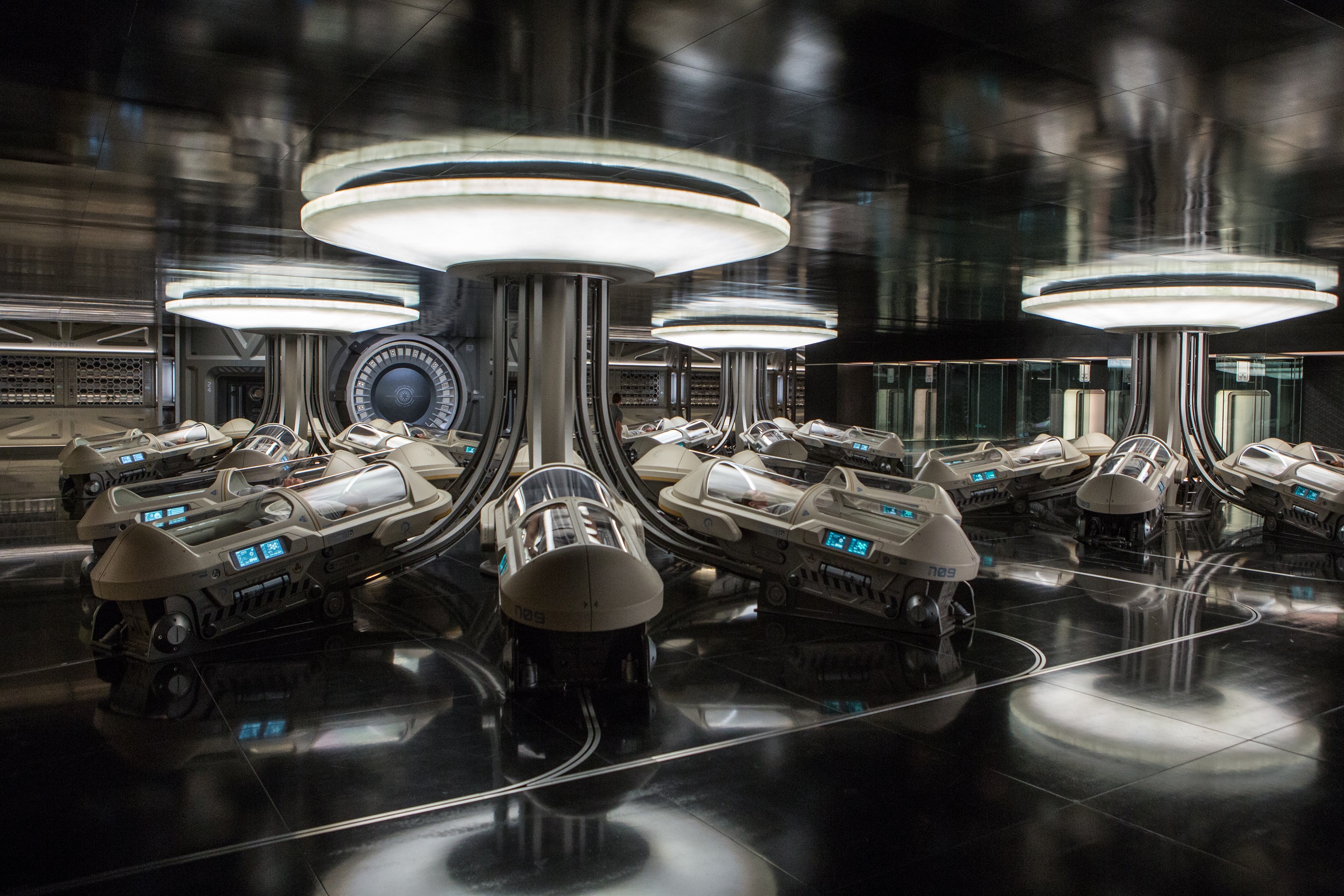
Dyas: I started with physical sketches — the swimming pool, hibernation pods and bar — I filled entire sketchbooks with these quick drawings. The original idea was to have the romance of an ocean liner, but something that was based on science. There are crew quarters, a big ring at the front of the ship for the crew and the captain, who are also hibernating. So using wonderful renderings from my team that were based on my original scrappy sketches, we designed and actually built sections of this structure that were the exact diameter and shape of the ring that would be on the ship. These were a rolling set that would allow you, rather like a hamster wheel, to stand or walk as the set moved underneath you. It was a bit like the centrifuge in "2001," where the actor ran as the ring rotated. [Stanley Kubrick's Iconic '2001: A Space Odyssey' Sci-Fi Film Explained]
Space.com: What about some of the other interiors? Certain locations are very grand, vast and sometimes lavish.
Dyas: There's an enormous grand concourse, a huge shopping mall. In our story, these passengers are in hibernation as they travel to a distant planet. But there will be four months of rehabilitation and grogginess that must be overcome once they wake up. And since this mission is mounted by a company who has put this ship together, they are looking for revenue opportunities. So they have created this enormous shopping mall for the people on board to go to and buy components for their new homes, so the company can generate revenue at the back end of this huge business venture before these people get into their drop ships and travel down to their ultimate destination.
Space.com: So were these huge physical sets?
Dyas: Yes, it was important to us that we build literally everything. All the interiors were built, physically constructed.
Space.com: There are quite a variety of architectural and décor choices evident in the film, things we don't traditionally expect to see in a starship. What was your inspiration?
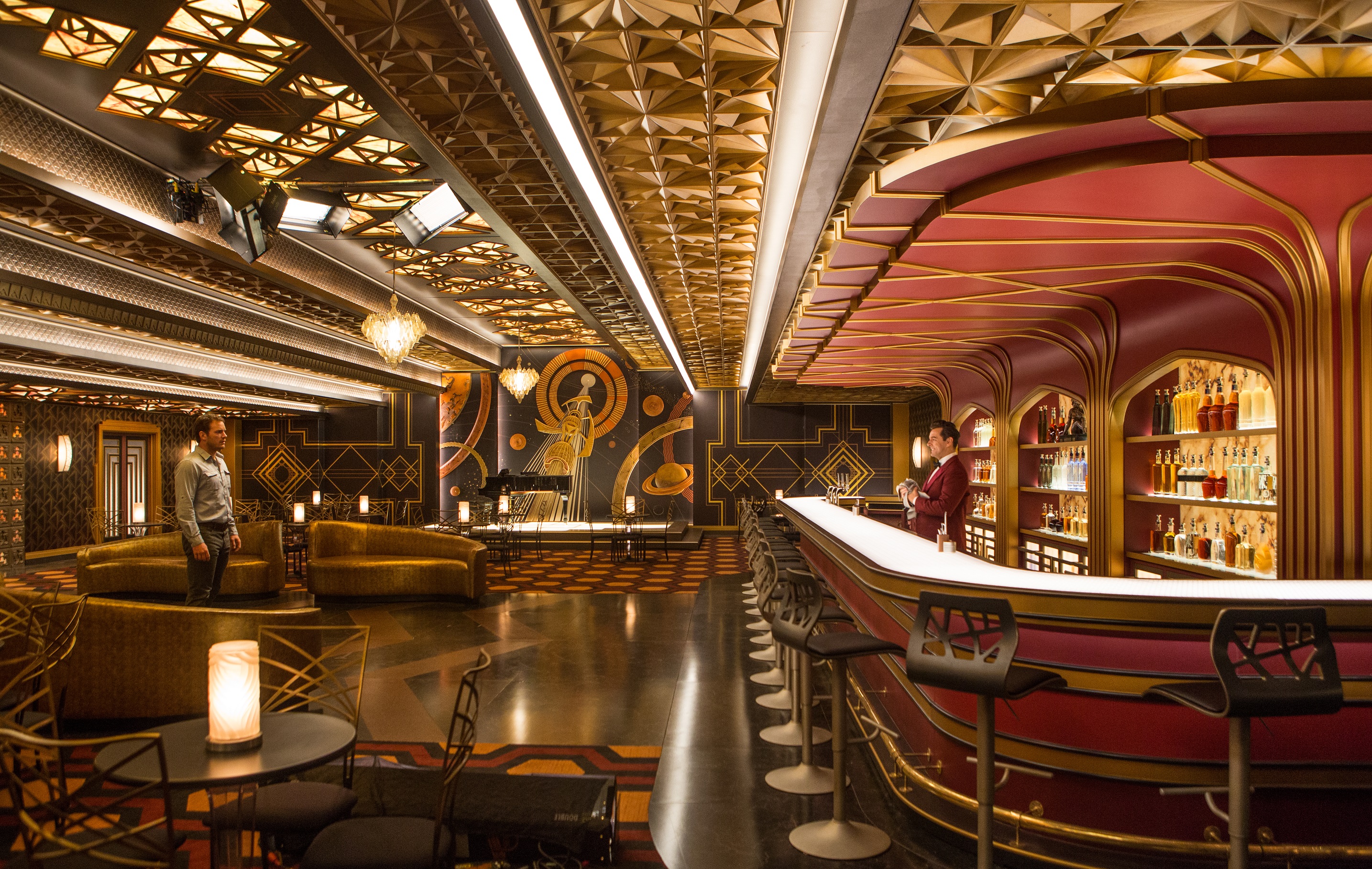
Dyas: A lot of people have asked about why we have such a radical change in the aesthetic within the ship, especially regarding the art deco bar. Most movie spaceships are designed with a singular aesthetic throughout. But since this was based on a cruise ship aesthetic, we had an opportunity to play with the moods of the scene and get the audience on board with the idea of why our two passengers would even want to go into a certain place by making the spaces seductive. And we had a lot of bar scenes. So my notion was, why alienate people? Let them feel like they are at home, design it like a New York bar. I took inspiration from Stanley Kubrick's "The Shining" here, because the relationship between Chris Pratt's character and the barman — who doesn't have any legs and can't go anywhere — reminded me of the strange relationship between Jack Nicholson and the barman in "The Shining." So that was an inspiration for the bar, although our bar needed to be more bejeweled, more glorious and more outrageously beautiful than the bar in the Overlook Hotel. So the space became a huge jewelry box that attracts our characters to these scenes that happen in the bar where lots of the intrigue of this film becomes unraveled.
"Passengers"opens in wide release Dec. 21. This interview has been edited for length.
Follow us @Spacedotcom, Facebook and Google+. Original article on Space.com.
Join our Space Forums to keep talking space on the latest missions, night sky and more! And if you have a news tip, correction or comment, let us know at: community@space.com.
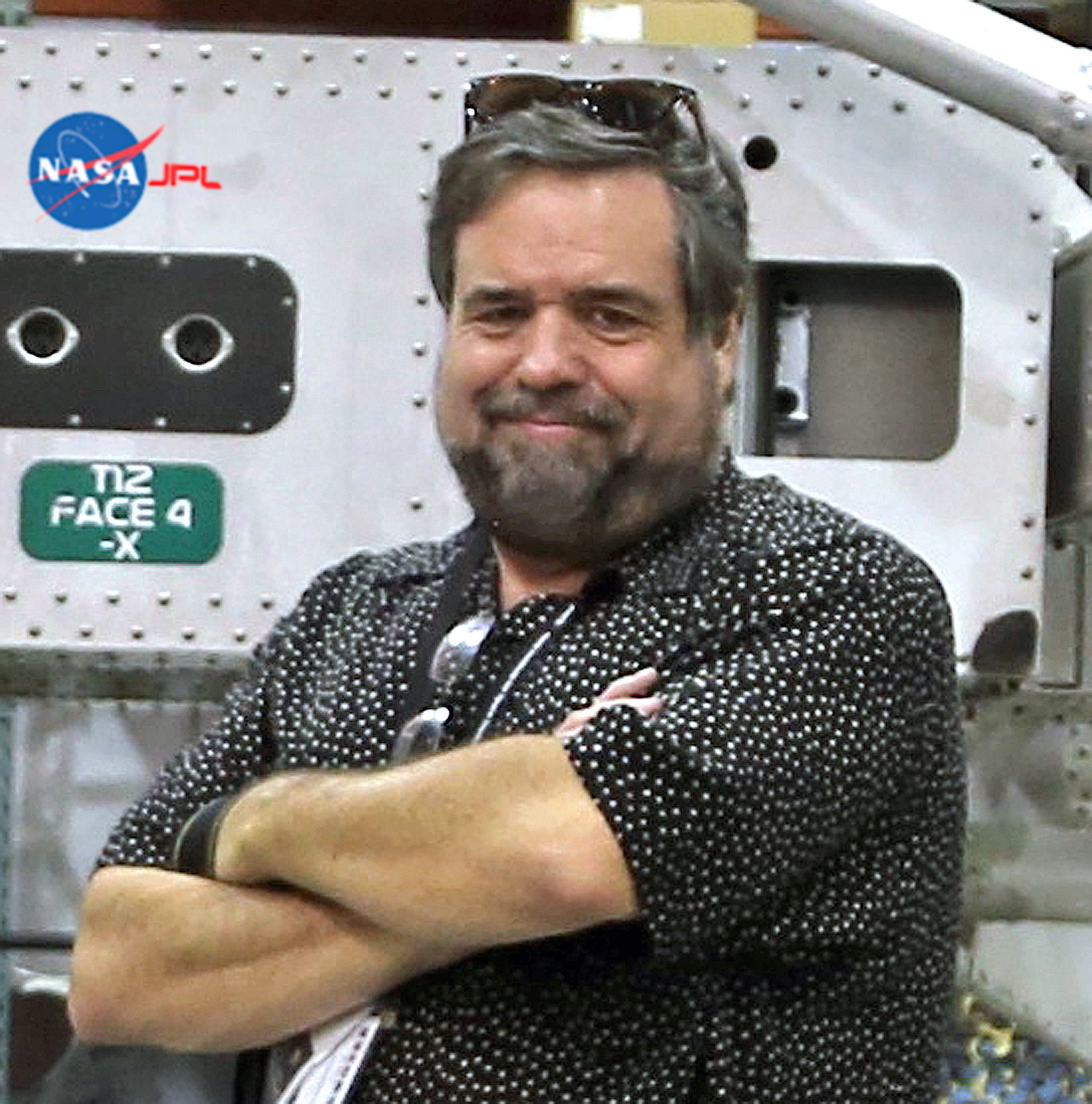
Rod Pyle is an author, journalist, television producer and editor in chief of Ad Astra magazine for the National Space Society. He has written 18 books on space history, exploration and development, including "Space 2.0," "First on the Moon" and "Innovation the NASA Way." He has written for NASA’s Jet Propulsion Laboratory, Caltech, WIRED, Popular Science, Space.com, Live Science, the World Economic Forum and the Library of Congress. Rod co-authored the "Apollo Leadership Experience" for NASA's Johnson Space Center and has produced, directed and written for The History Channel, Discovery Networks and Disney.


