Science Videos Wow Judges in Data-Visualization Face-Off
"Wow us with your best data!" That was the challenge issued by the journal Science for its second annual data-visualization competition, called Data Stories. And today (May 4), Science announced the four winning entries.
A judging panel chose standouts in three categories: student, professional and corporate entity. An online poll conducted from April 17-23 picked one People's Choice winner.
The contest, open for entries from Feb. 13 to April 14, accepted short videos no longer than 90 seconds in length, looking for submissions that used imaginative animation and storytelling methods to visually communicate stories crafted from scientific data. Entries were judged on "creativity, complexity and clarity," a contest representative told Live Science in an email. [See Video of the Data Visualization Winners]
In the Student Entry category, the winner was "Wait ... How Many People Died?" by Kate Bredbenner, a doctoral candidate studying HIV in the Laboratory of Cellular Biophysics at Rockefeller University in New York. Bredbenner also produces and stars in a YouTube series called SimpleBiologist, in which she draws on whiteboards to explain scientific research. She used this technique for her contest entry, which explored the challenge of grasping the meaning behind large numbers, particularly when they represent death tolls.
"This video was made to provide visuals for big numbers, which is something that I frequently have to do as a science communicator. It also shows the magnitude of the death tolls in early American history compared to today," Bredbenner said in a statement.
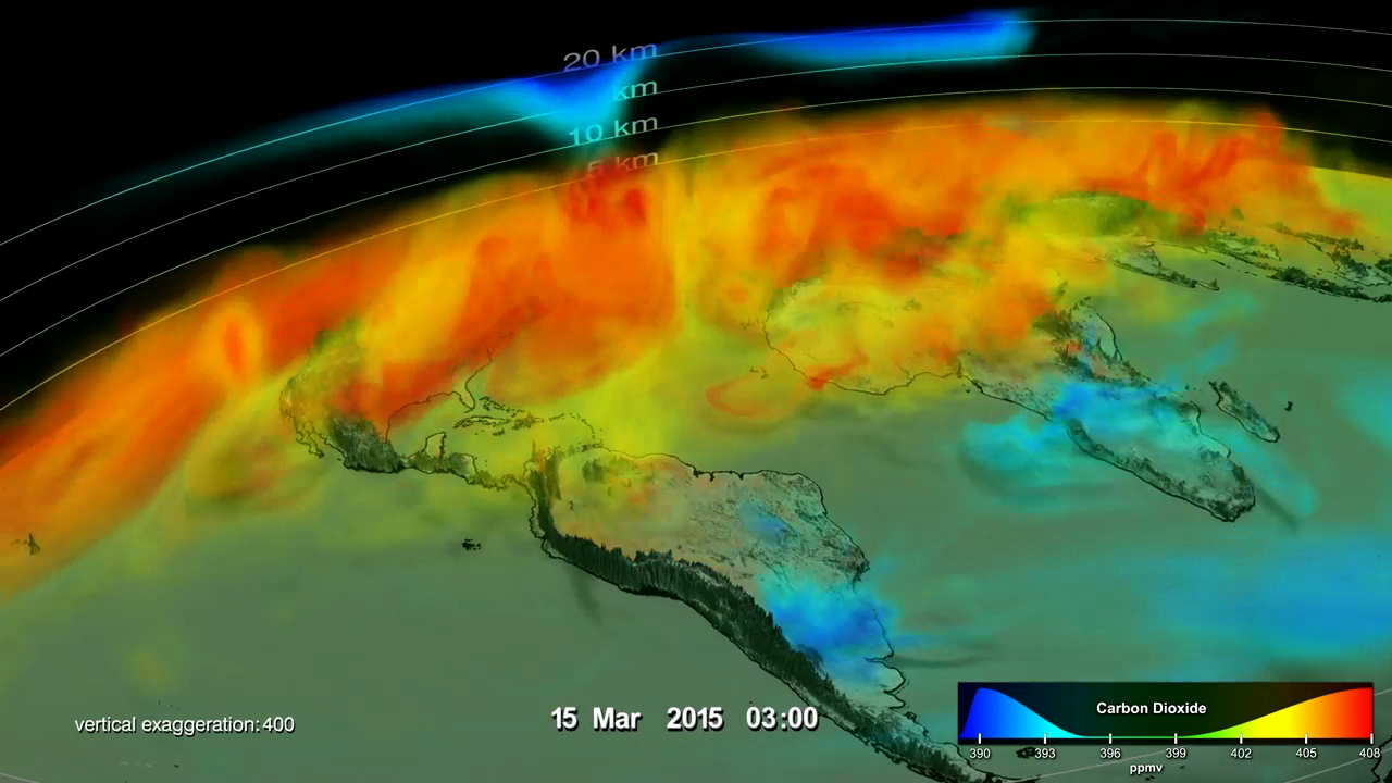
Top prize for the Professional Entry category went to "Seasonal Changes in Carbon Dioxide," submitted by Gregory Shirah, a producer of Earth-science-related visualizations for the Scientific Visualization Studio at NASA Goddard Space Flight Center.
In Shirah's video, a colorful 3D visualization of atmospheric carbon dioxide shows how the greenhouse gas behaves in the Northern Hemisphere from season to season, and how the gas is influenced by changing weather patterns and airflow over land features.
Get the Space.com Newsletter
Breaking space news, the latest updates on rocket launches, skywatching events and more!
For the Corporate Entry category, the top prize was awarded to "Ecological Footprint of Countries: Deficit or Reserve?" submitted by Ronna Kelly, director of marketing and communications for Global Footprint Network, a research organization dedicated to shaping sustainability practices around the world.
The video showcases visualizations created by the open-data platform Ecological Footprint Explorer and explores "consumption and availability of renewable natural resources for more than 200 countries and regions," according to the video's YouTube description.
And the People's Choice award went to "Listening to Landscapes" by Sam Hooper, a doctoral candidate with the Kennedy Geospatial Lab at Oregon State University. Hooper turned to animated satellite data to illustrate the dynamic nature of Earth's surface as it gradually shifts over time.
"It's often difficult to think of a landscape existing in any other form than how we presently see it," Hooper said in a statement.
"Landscapes, however, are constantly changing," he added.
All of the video submissions for the 2017 Data Stories competition are available to view on the Science website.
Original article on Live Science.
Join our Space Forums to keep talking space on the latest missions, night sky and more! And if you have a news tip, correction or comment, let us know at: community@space.com.


