Why NASA Needs a New Logo
Michael D. Shaw is a biochemist and freelance writer. A graduate of the University of California, Los Angeles, and a protégé of the late Willard Libby, winner of the 1960 Nobel Prize in chemistry, Shaw also did postgraduate work at MIT. Based in Virginia, he covers technology, health care and entrepreneurship, among other issues.
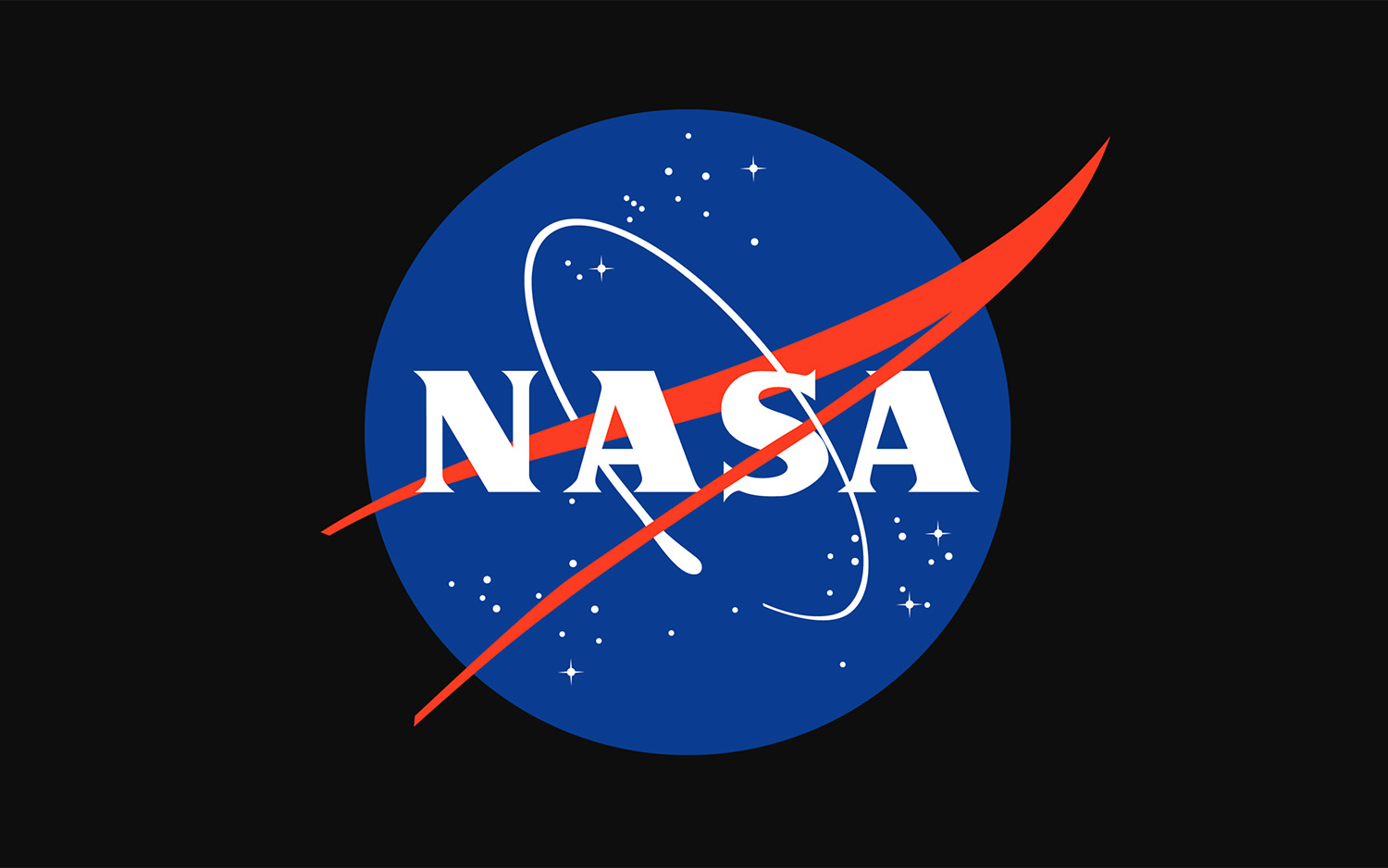
NASA's logo needs a refresh. The agency's official logo, the 59-year-old "meatball insignia," features a sphere to represent a planet, stars to represent space and a red chevron or "wing" to represent aeronautics, with white N-A-S-A lettering in the center. This logo looks like it belongs in a museum, commemorating the past, not celebrating the future. As NASA celebrates its 60th anniversary this year, this seems like a good time for the agency to update its antiquated logo.
A scene from the film adaptation of Tom Wolfe's "The Right Stuff" best demonstrates the importance of imagery to the success of the space program. When the astronauts of Project Mercury demand that their space capsule have a window, the engineers rebuff them, claiming that the astronauts won't need one because they don't actually get to pilot the fully automated spacecraft.
NASA astronaut John Glenn (played by Ed Harris) then points to the gaggle of reporters and photographers outside the hangar, and his fellow astronaut Gordon Cooper(Dennis Quaid) explains that good publicity is important, because "funding makes this bird go up." To wit, Virgil "Gus" Grissom (Fred Ward) says, "No bucks, no Buck Rogers."
Allow me to include the following addendum: "No logo, no liftoff." That is, NASA needs a new and improved logo that better illustrates the agency's current mission and visions for the future. The old meatball insignia looks more like a throwback to midcentury modern design than a symbol of 21st-century advancement.
I recognize how subjective this issue is. I also know that appearances matter, because I am a scientist whose research funding has depended both on the quality of my work as well as its face value. Feelings oftentime trump reason when a person's first impression is driven by superficial qualities rather than substance.
If NASA wants to increase its funding — and fuel interest in its projects — it needs to project an image commensurate with its ambitions. It needs to have a logo that reflects its goals and pays homage to its history, without looking like a relic of the past.
Get the Space.com Newsletter
Breaking space news, the latest updates on rocket launches, skywatching events and more!
According to graphic designers at theParsons School of Design and the chief design officer at DesignMantic, NASA's logo does not represent its present-day mission. Designed by employee James Modarelli in 1959, it was appropriate for its time. It had the look and feel common to the Space Age or the Atomic Era.
The meatball logo does not capture the dynamism of the agency's achievements on Mars or its exploration of the moons of Jupiter or the rings of Saturn. It does not capture the discovery of exoplanets or the search for extraterrestrial life.
The logo looks more vintage than victorious, according to the designers I interviewed. (Disclosure: None of the designers I spoke to works for, or has worked with, NASA. They are all experts, however, regarding branding campaigns for major public or private organizations.)
The logo is an anachronism.
A new logo should appeal to the entire nation, since NASA works with scientists and engineers throughout the United States and is funded by American taxpayers. It should show us where the agency intends to go, with our flag planted not in conquest but in camaraderie, with satellites among the stars and our spaceships as vessels of peace and goodwill.
If we want this bird to go up — if we want to"light this candle" — and if we want America's space agency to look like it has the "right stuff," then we had best ensure NASA has the right logo.
In a competition to win funding, and in a contest to win hearts and minds, symbols elicit a variety of emotions. While a well-crafted symbol can make a good impression, an unremarkable or out-of-date insignia may inadvertently convey the wrong message.
NASA must summon the best feelings, so it may do its best work. It must inspire Americans and be an icon throughout the world.
Follow us @Spacedotcom, Facebook and Google+. Original article on Space.com.
Join our Space Forums to keep talking space on the latest missions, night sky and more! And if you have a news tip, correction or comment, let us know at: community@space.com.

