Nine Lightroom tips and tricks you probably didn't know
Adobe's image editing app is complex, so here are some less well-known tips to help you master it.

All of the best photo editing apps have something in common - there are a lot of features! Beyond the obvious editing tools, there are many keyboard shortcuts and hidden workarounds which many of us don’t realize are there.
Once you’ve got to grips with the basics of editing in Adobe Lightroom, knowing which tools and shortcuts can speed up your workflow is an absolute game changer. If you have a large number of astro-photos you're trying to tweak, these tools can help you get the best out of your images and cut down on editing time drastically
If you're looking for more advice, we also have an in-depth guide on how to edit photos in Lightroom. But for now, here are nine of our favourite Lightroom tips and tricks that you may not already know.
Tip 1: Grid Overlays
Our first Lightroom tip can really help when it comes to lining up your composition. You’re probably aware of the rule of thirds, but Lightroom has a number of different grid overlays for different types of composition.
To access these, head over to the crop tool (or use the shortcut “r” on your keyboard).
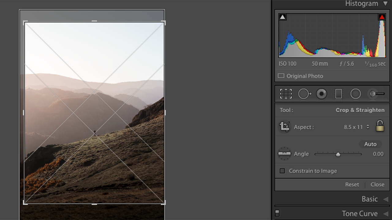
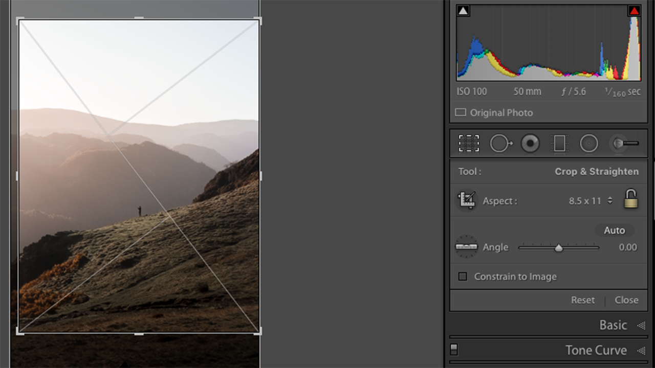
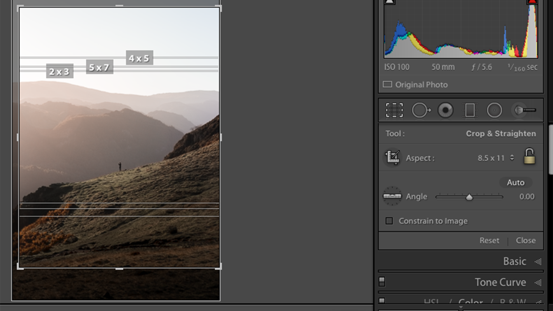
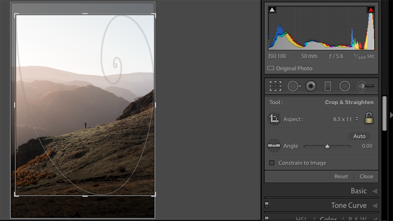
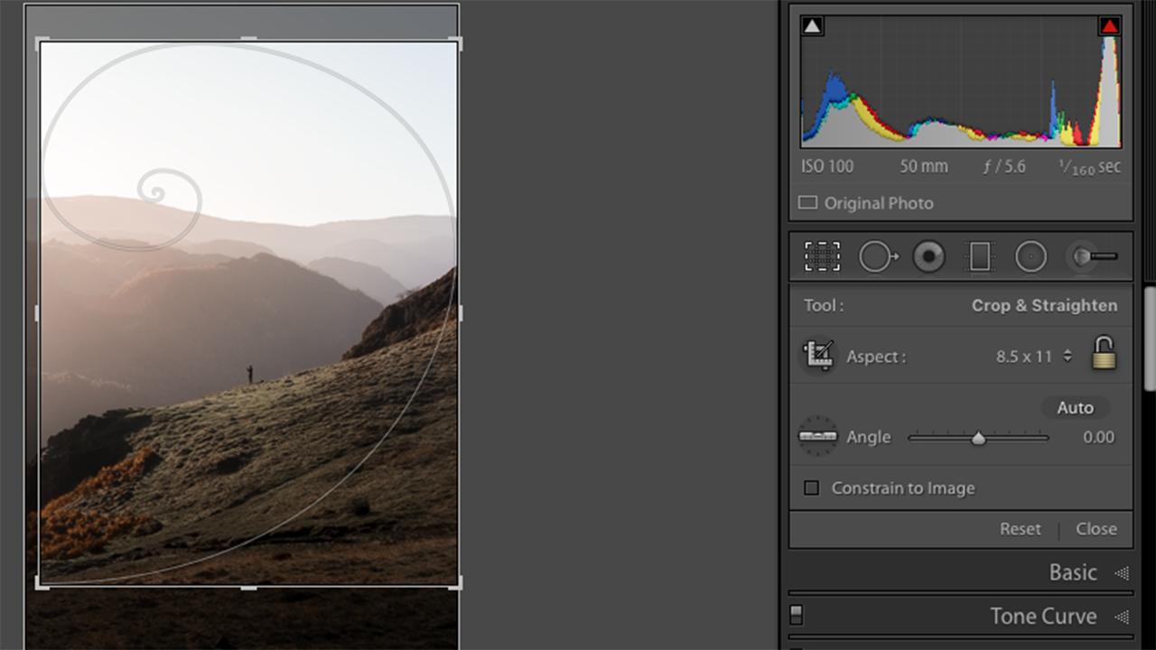
Once you’re in the crop tool, press O on your keyboard to cycle through the different grid overlays and choose the one which best fits your image.
You can also flip and rotate the overlays. We like to use this on the golden spiral overlay when we’ve used leading lines in an image. To rotate the grid, press Shift + O on your keyboard.
Tip 2: Isolating your image
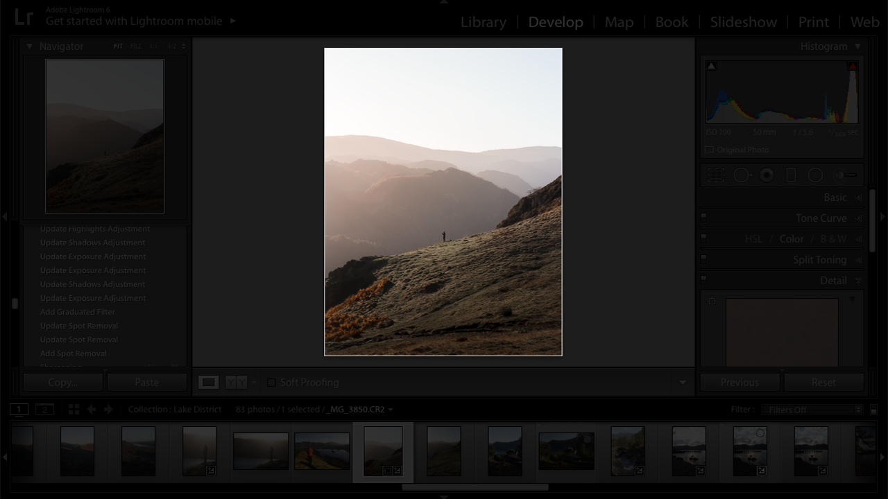
When you’re editing your image, it can be really helpful to sit back and analyse your image without any distractions. There are a couple of keyboard shortcuts for this. The L key dims the rest of the screen so you can see your image by itself. Press L again and the background will go completely black. You can also use F for a full screen version of your image with a dark background. This can really help you to determine if there’s anything in your image that you need to change.
This also brings us onto the next tip…
Tip 3: Changing the background colour
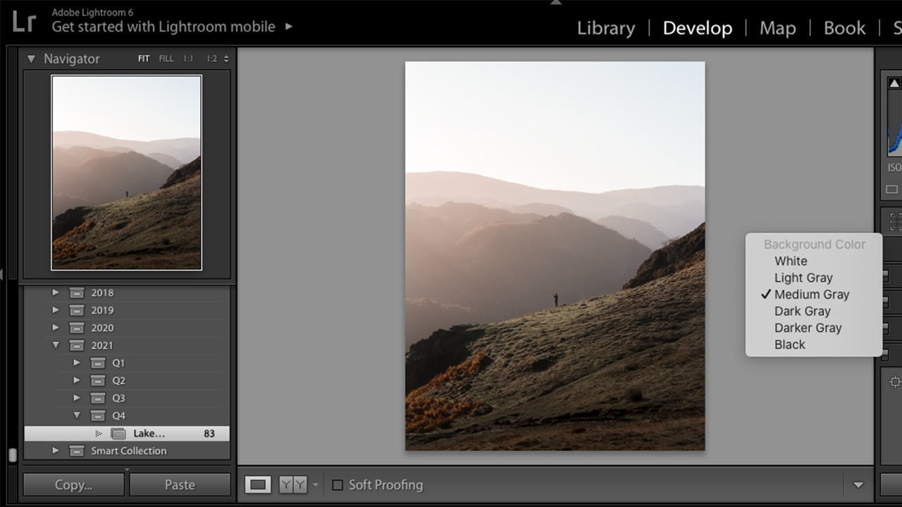
If you have a particularly bright or dark image, it can be helpful to change the background colour in Lightroom to compliment the tones in your image. It’s the same concept as deciding whether to mount your printed images on a white or black frame. You can use a white background to see if your image needs brightening, or a black background to see how dark your image is. Often we think the image is too bright on a screen because it’s backlit, so seeing it against true white can really help get the levels right.
To do this, right click in the blank space around your image, and choose one of the colour options.
Tip 4: Auto mask
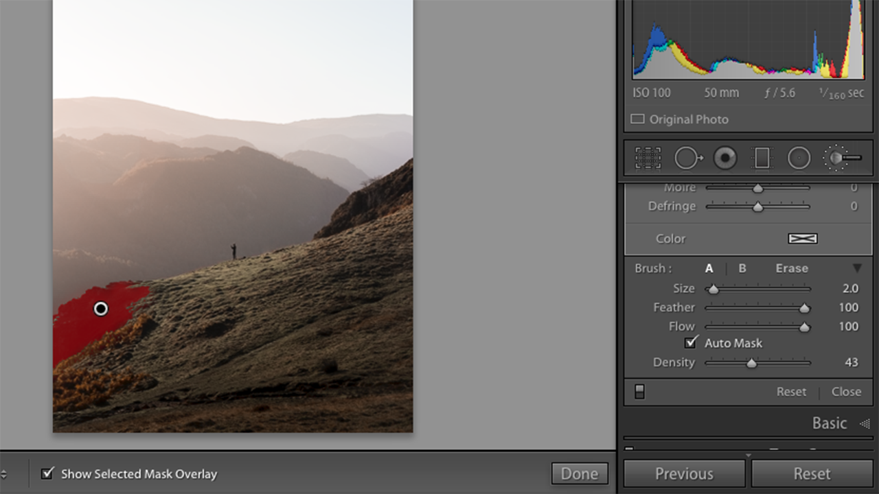
How much time have you spent cleaning up the edges of your brush tool when painting over something small and specific? The auto mask tool saves so much time when editing, you'll wish you'd discovered it sooner.
To use auto mask, select the brush tool and scroll down to the bottom of the panel. Make sure the auto mask box is ticked, and when you use the brush on your image there won’t be any ‘colouring outside the lines’. This tool works by identifying the different tones and exposure levels in your image which it thinks you want to edit. If, however, you are trying to brush over an object which has similar tones around it, it won’t always be totally accurate. In this instance we’d recommend you zoom in so you can use the brush tool more precisely.
Tip 5: Longer sliders
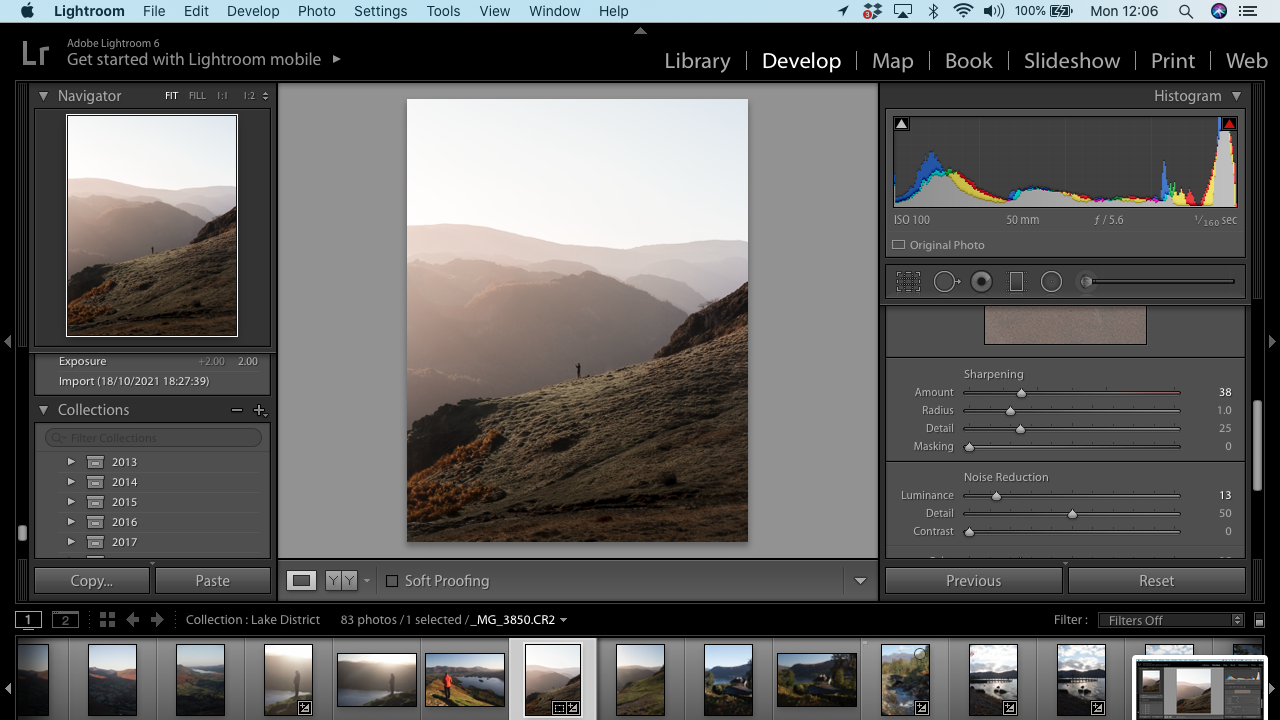
During the editing process it can be easy to move the sliders too drastically, especially if you’re working on a small screen. To make them bigger, grab the edge of the panel and drag it out (towards the image). Now you will be able to use the sliders with more precision.
Tip 6: Before & After
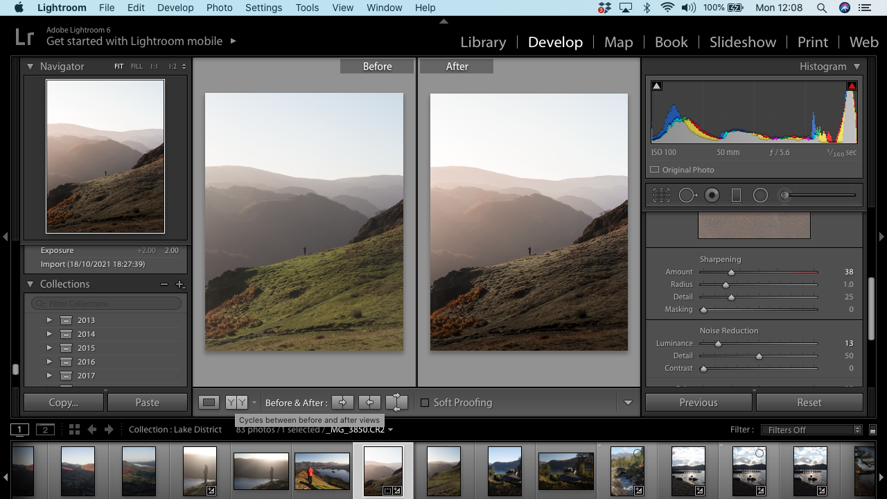
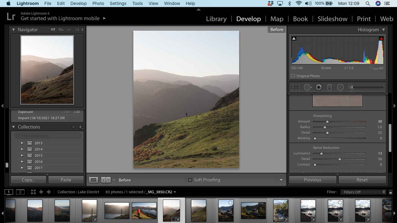
If you want to see a before & after comparison of your image, there are a number of ways to do this. To see a side by side comparison, press Y on your keyboard, or click the icon in the panel underneath your image. You can also press the \ key to see the full size image before any edits were done to it, and press \ again to return to your edited photo. This tool can be so helpful in the editing process to make sure you haven’t taken your edit too far.
Tip 7: Clipping
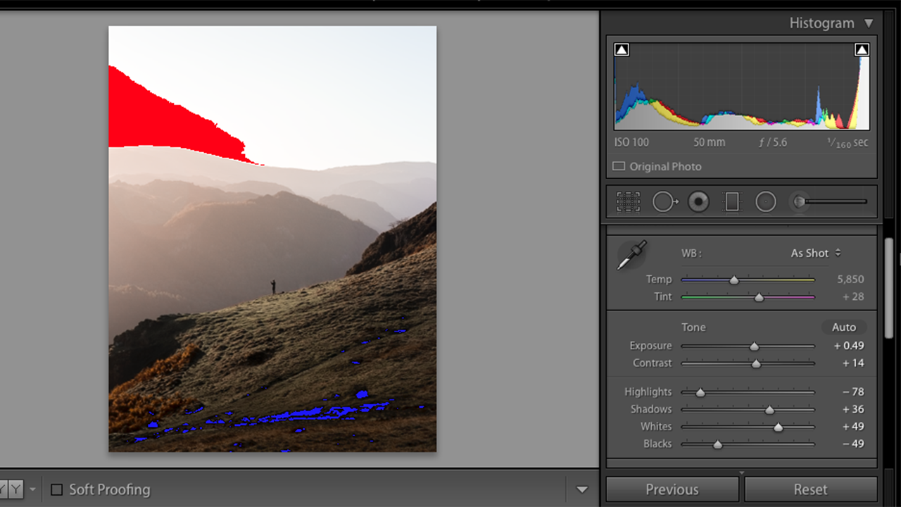
It can be difficult to see which parts of your image are too bright or too dark on a screen. (This is why learning to read a histogram is so important!) If you want to see where your image is clipped, press the J key on your keyboard. If your image is well exposed, nothing will happen (this is good!). However, if parts of your image are either too white or too black, you will see colours appear on your screen. Red means that particular section is too white, and blue means it’s too black. To correct this, just move the whites & blacks sliders until the colours disappear. It is important to use common sense with this tool though, as in many astrophotography and nighttime images it will show clipping in the blacks, but you may actually want a lot of black in your astro images.
Tip 8: Solo mode
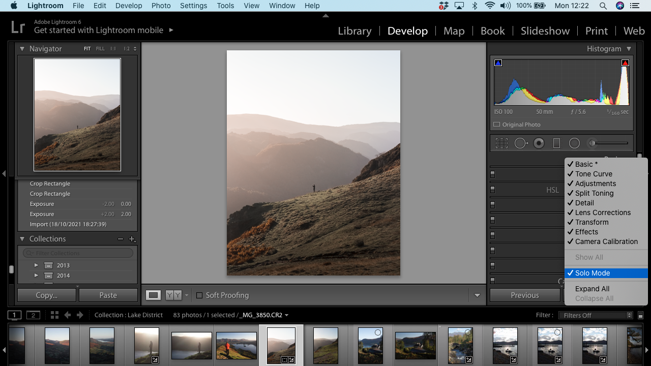
To a beginner Lightroom user, the number of different panels can be a bit overwhelming. Solo mode can be useful if you want to avoid having to scroll up and down to find a certain panel. This means that there will only ever be one editing panel open at a time, so when you click on a particular panel, any others that are open will close automatically. This also makes it easier to move between all the different panels because you can actually see them all. To enable solo mode, right click on the editing panel on the right, then select solo mode.
Tip 9: Organising your images
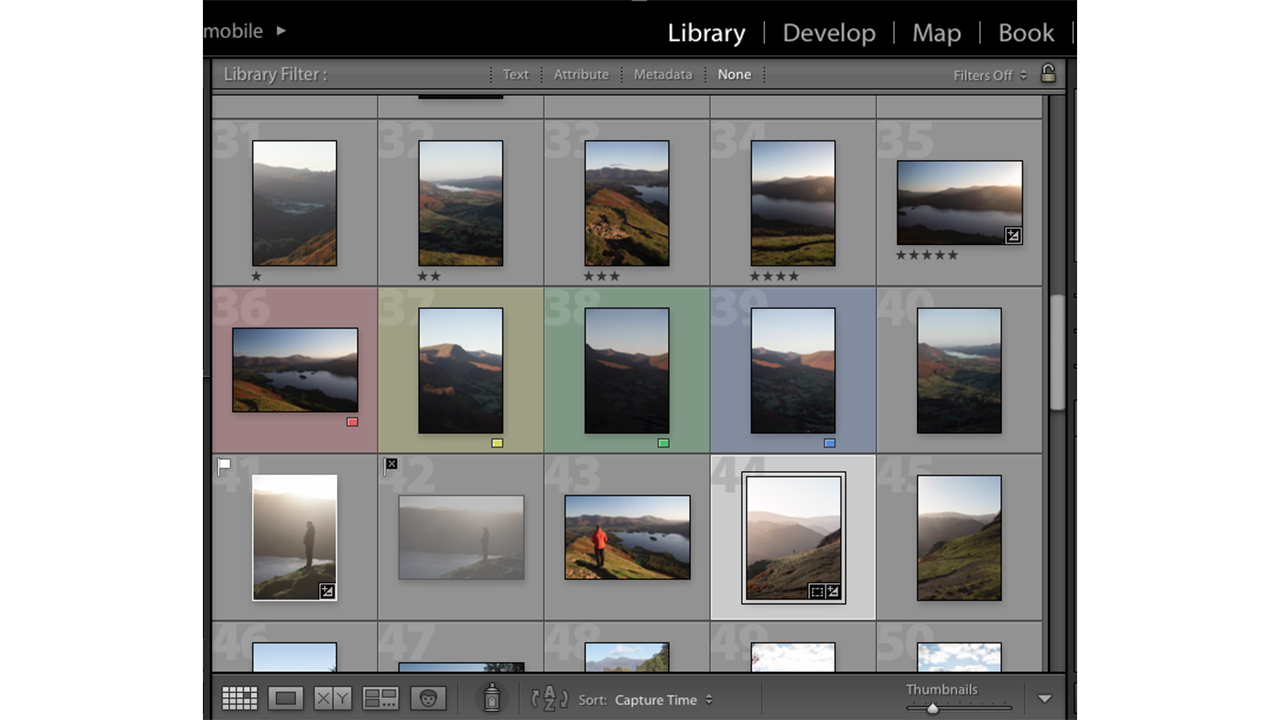
Our final tip is one of the most useful things you can do with your images, which is knowing which keyboard shortcuts to use to organise and flag your work. This can be especially helpful if you’ve taken a lot of images and need to sort through them quickly to only edit the ones you want to keep, or if you’re working with clients and you need to flag which images you’d like to show them.
On your keyboard, numbers 1-5 will give the photo a star rating. The numbers 6, 7, 8, 9 will give a colour outline to the thumbnails. P flags an image, X rejects a photo, and U removes the flag and sets the image back to where you started.
Join our Space Forums to keep talking space on the latest missions, night sky and more! And if you have a news tip, correction or comment, let us know at: community@space.com.
Get the Space.com Newsletter
Breaking space news, the latest updates on rocket launches, skywatching events and more!

Kimberley Lane is a landscape & seascape photographer living in South Wales. Originally using photography as a way to cope with health issues, she aims to portray a feeling of calm and peace through her images. Her work has been featured in a number of national photography magazines.


