Astrophysicists create the most accurate 'flat map' of Earth ever
Here are two pancake maps of Earth.

Earth is a sphere, so how can it be accurately portrayed on a 2D map? Simply flatten Earth into two pancakes, one depicting the Northern Hemisphere and the other the Southern, with the equator running around the edge, a new study finds.
These two "pancakes" represent the most accurate flat map of Earth ever made, the study researchers said. Unlike other flat maps, the new circular map doesn't downsize or supersize the area of certain oceans or landmasses — for instance, many 2D maps depict Greenland as about the same size as Africa, when in fact Africa is 14 times larger, Scientific American reported.
Plus, unlike some retangular maps that are very large, "this is a map you can hold in your hand," study lead researcher J. Richard Gott, an emeritus professor of astrophysics at Princeton University, said in a statement. "The map can be printed front-and-back on a single magazine page, ready for the reader to cut out."
Related: Photos: Christopher Columbus likely saw this 1491 map
Creating accurate 2D maps has dogged cartographers for centuries. To help determine the various problems flat maps face, Gott and study co-researcher David Goldberg, a professor of physics at Drexel University in Philadelphia, created a system to rate existing flat maps, and published their results in 2007 in the journal Cartographica. Their system scored 2D maps on six types of distortions: local shapes, areas, distances, flexion (bending, or curvature distortions), skewness (lopsidedness) and boundary cuts (continuity gaps, like splitting up the Pacific Ocean). Maps that received lower scores were more accurate, they said. Well-designed globes, which are spherical like the Earth, would earn scores of zero.
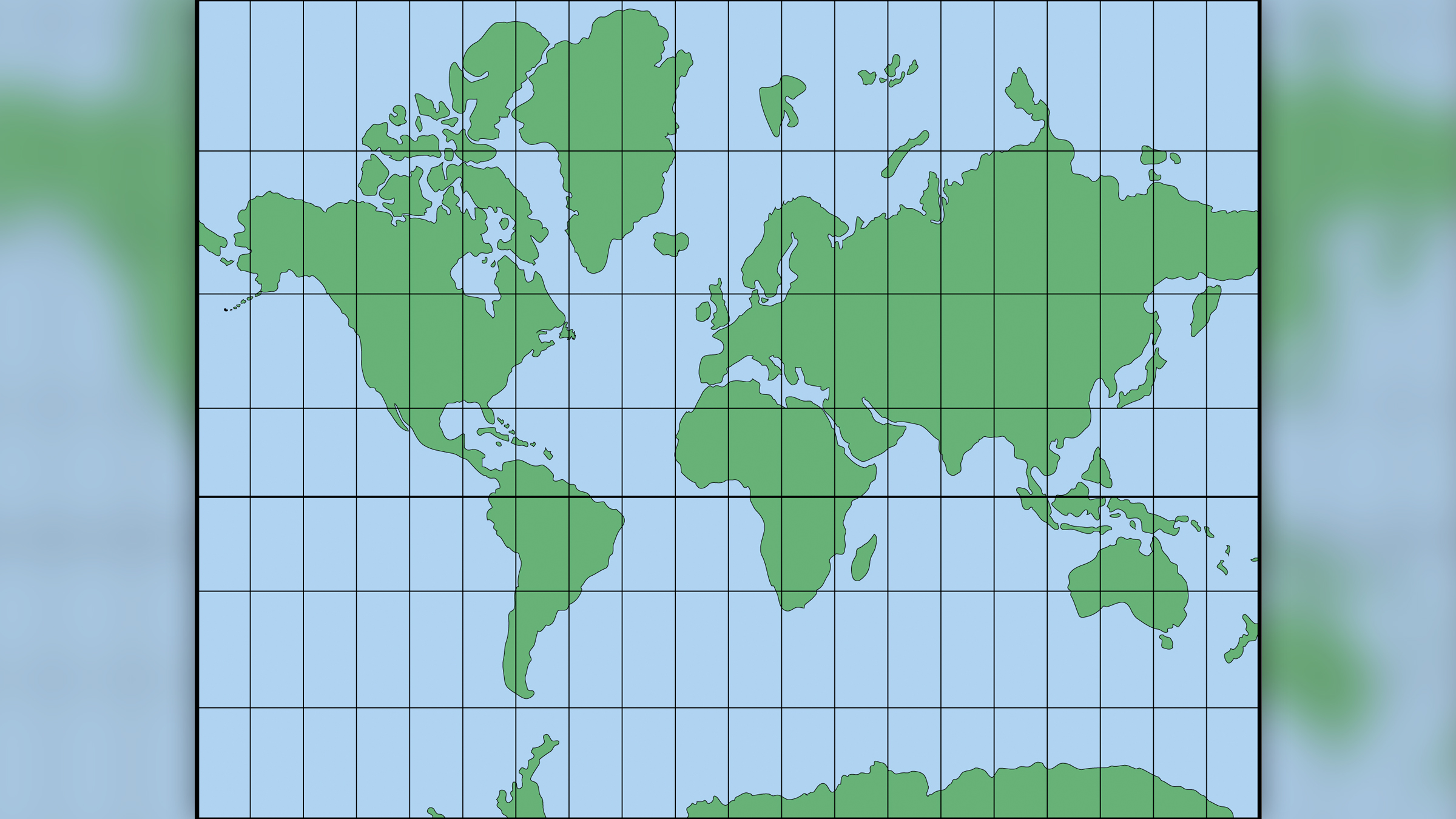
"One can't make everything perfect" on a flat Earth map, Gott said. "A map that is good at one thing may not be good at depicting other things." Take, for example, the world map most people are familiar with — the Mercator projection, a staple found in many classrooms and the basis for Google Maps. While the Mercator projection is good at representing local shapes, it distorts surface areas near the North and South Poles, so these regions are often chopped off, the researchers said.
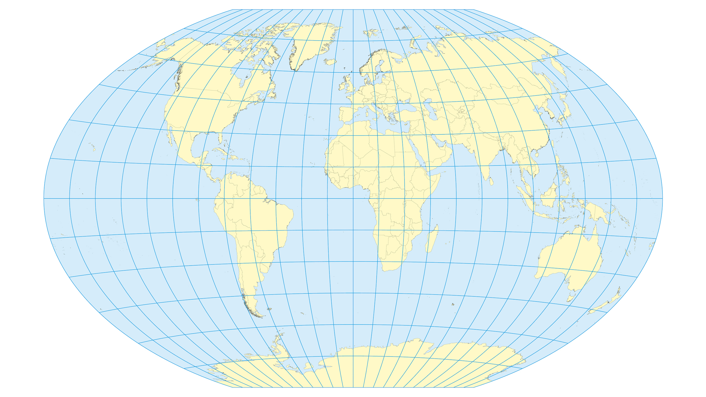
According to the team's rating system, the top-rated flat map projection is the Winkel Tripel, a map that originated in 1921, when German cartographer Oswald Winkel proposed it, and which the National Geographic Society now uses. This map drew a low score of 4.563, but it still had a "boundary cut" problem, because it split the Pacific Ocean in two, with one part on the right and the other on the left side of the map. This split creates the illusion that Asia and Hawaii are farther apart than they really are.
Get the Space.com Newsletter
Breaking space news, the latest updates on rocket launches, skywatching events and more!
To get around this boundary-splitting problem, the researchers approached mapmaking from a new perspective, with the hopes of designing a "flat map with the least error possible," Gott said. "We're proposing a radically different kind of map, and we beat Winkel Tripel on each and every one of the six errors."
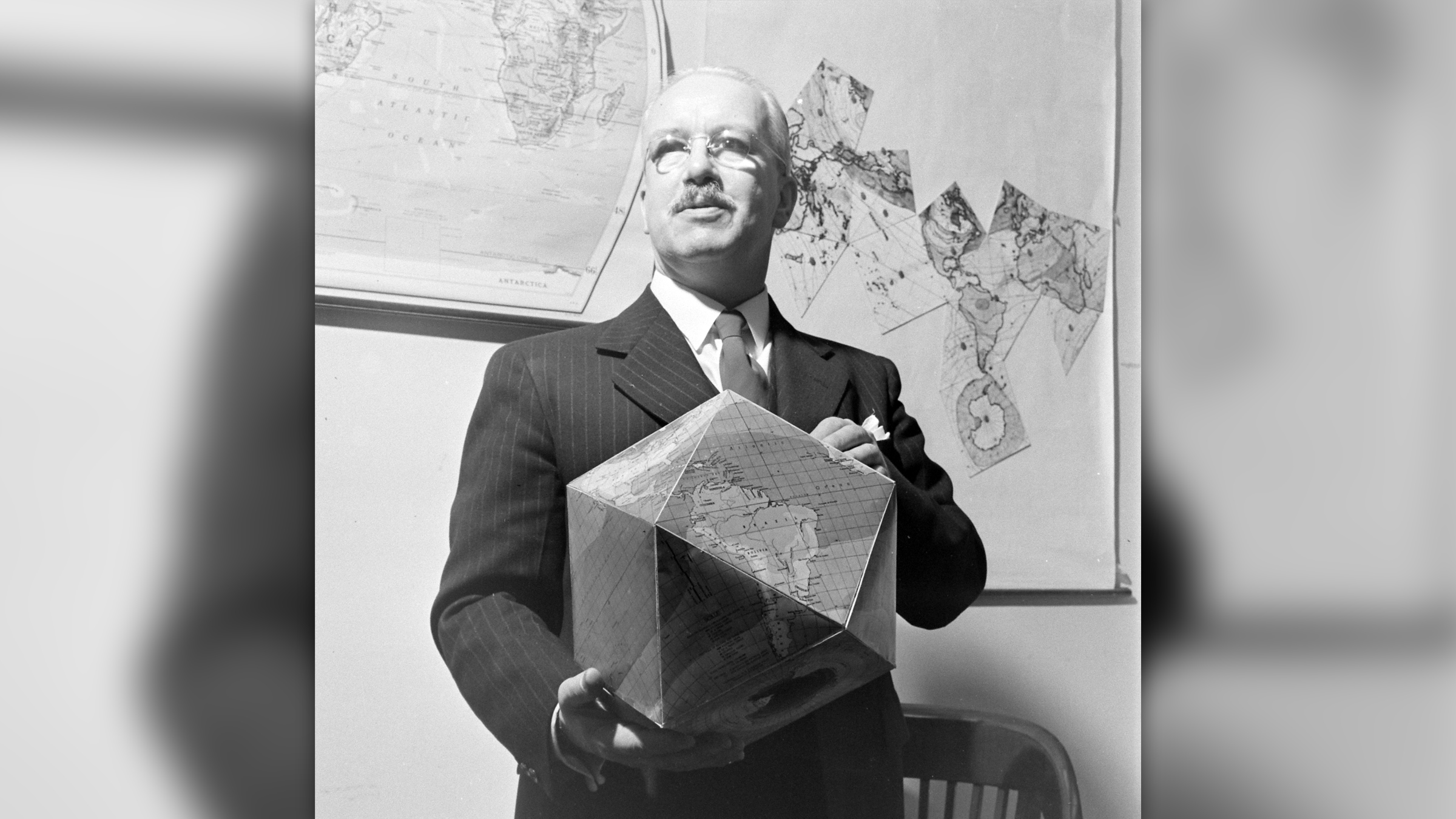
The end result, the pancake map, borrowed ideas from previous research on polyhedra, or many-sided 3D shapes. In 1943, the American architect Richard Buckminster Fuller drew outlines of regular shapes that made up a world map, and he wrote instructions for how his map could be folded into a polyhedral globe. But while Fuller did a good job detailing the continents, he wasn't as exact with the oceans, which introduced errors. For instance, Australia and Antarctica were too far apart on his creation.
In a 2019 study posted to the arXiv database, which has yet to be peer reviewed, Gott considered "envelope polyhedra," which involved gluing together regular shapes, back-to-back. This led to the idea of a double-sided circular map, he said.
The new map, published Feb.15 to the arXiv database, consists of two pancake maps that can be viewed side-by-side or back-to-back. Either way, the map doesn't have any boundary cuts. If you want to measure distances from one hemisphere to the other, just use a string or a measuring tape to reach around the side of one pancake to the other, Gott said.
"If you're an ant, you can crawl from one side ... to the other," Gott said. "We have continuity over the equator. [Africa] and South America are draped over the edge, like a sheet over a clothesline, but they're continuous."
The pancake map also has smaller distance errors than any other 2D flat map. For instance, its configuration means distances can't be more or less than 22.2% of what they are in reality, Gott said. In comparison, the Mercator and Winkel Tripel projections have remarkably high distance errors near the poles and at the left and right edges of the map.
What's more, areas at the pancake map's equatorial edge are only 1.57 times larger than areas at the center, the researchers said.
Gott said he's not aware of any other double-sided pancake Earth. "Our map is actually more like the globe than other flat maps," Gott said. "To see all of the globe, you have to rotate it; to see all of our new map, you simply have to flip it over."
Gott and his colleagues have also created pancake-like maps of Mars, Jupiter, the sun and other heavenly bodies, which can be seen here.
Originally published on Live Science.
Join our Space Forums to keep talking space on the latest missions, night sky and more! And if you have a news tip, correction or comment, let us know at: community@space.com.

Laura is an editor at Live Science. She edits Life's Little Mysteries and reports on general science, including archaeology and animals. Her work has appeared in The New York Times, Scholastic, Popular Science and Spectrum, a site on autism research. She has won multiple awards from the Society of Professional Journalists and the Washington Newspaper Publishers Association for her reporting at a weekly newspaper near Seattle. Laura holds a bachelor's degree in English literature and psychology from Washington University in St. Louis and an advanced certificate in science writing from NYU.

