Trump unveils new Space Force logo (yes, it looks like something from 'Star Trek')
But there's more to the story.
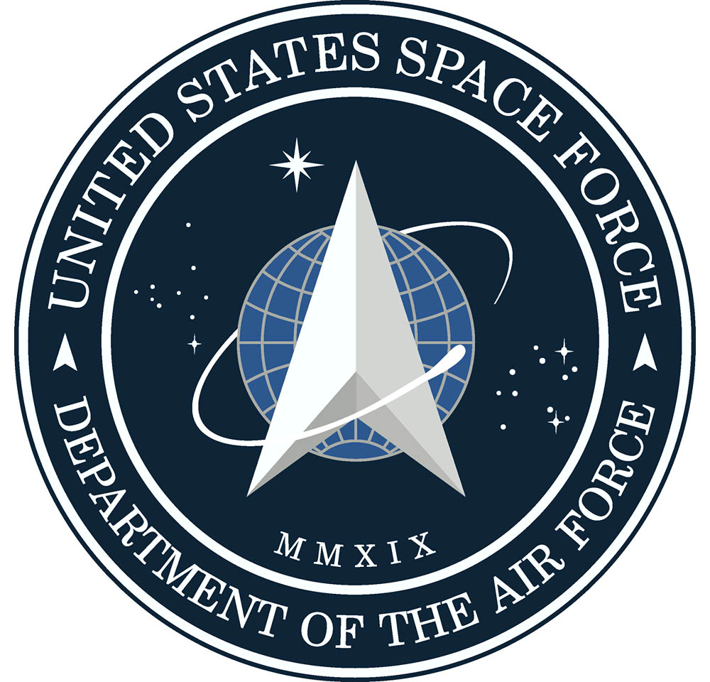
President Donald Trump on Friday (Jan. 24) officially unveiled the logo for the U.S. Space Force and the reaction has been strong. It might just be because the logo, which draws heavily on the new military branch's Air Force heritage, bears a striking similarity to a "Star Trek" insignia.
Trump announced the new Space Force logo on Twitter, the latest in a series of reveals for the newest branch of the U.S. military that included the service's new uniform nametapes last week, as well as the swearing in of Gen. John W. Raymond as Chief of Space Operations.
"After consultation with our Great Military Leaders, designers, and others, I am pleased to present the new logo for the United States Space Force, the Sixth Branch of our Magnificent Military!" Trump wrote in his announcement.
Related: Presidential Visions for Space: From Ike to Trump
After consultation with our Great Military Leaders, designers, and others, I am pleased to present the new logo for the United States Space Force, the Sixth Branch of our Magnificent Military! pic.twitter.com/TC8pT4yHFTJanuary 24, 2020
"Thank you for your continued leadership & support and . I couldn’t be more proud of our team as we continue to provide critical space capabilities for America (GPS, SATCOM, Missile Warning) while building our newest Armed Service," Raymond said wrote in response.
Some Space Force watchers were quick to point out the new logo's similarities to the arrow-like "Star Trek" insignia that the iconic science fiction TV series and film franchise has used for decades.
President Trump appeared to unveil the new US Space Force logo — and it bears an uncanny resemblance to the "Star Trek" insignia https://t.co/XXb6HSkKmV pic.twitter.com/RNrymkfj8NJanuary 25, 2020
The resemblance is clearly there, but the Space Force logo borrows more directly from its own military origins, with much of the look coming from the Air Force Space Command seal. That Space Command logo was also dominated by an arrow-shaped delta insignia set upon a stylized Earth with stars orbiting the planet, although that emblem had a more shield-like shape instead of the space mission patch look of the Space Force logo.
Get the Space.com Newsletter
Breaking space news, the latest updates on rocket launches, skywatching events and more!
For those excitedly tweeting that Trump stole the Star Trek logo!!!!, the patch on the left was the existing Air Force Command logo. The same one I wore as a Lieutenant in 2005. pic.twitter.com/mYb60YioBPJanuary 24, 2020
Space Force officials, for their part, have laid out the exact meaning behind the new logo and its symbolism.
"The creation of the U.S. Space Force seal pays tribute to the newest Armed Service that organizes, trains, and equips space forces in order to protect U.S. and allied interests in space and to provide space capabilities to the joint force," Space Force officials wrote in a Facebook post Friday.
"The U.S. Space Force seal honors the Department of the Air Force's proud history and long-standing record of providing the best space capabilities in the world," Space Force officials added. "The delta symbol, the central design element in the seal, was first used as early as 1942 by the U.S. Army Air Forces; and was used in early Air Force space organization emblems dating back to 1961. Since then, the delta symbol has been a prominent feature in military space community emblems."
Trump officially launched the U.S. Space Force in December when he signed the $738 billion National Defense Authorization Act for Fiscal Year 2020. Raymond was sworn in as Chief of Space Operations for the service on Jan. 14.
The Space Force is designed to safeguard U.S. assets and interests in space, as well as ensuring American leadership in the final frontier. Avoiding a military conflict in space is another major goal of the service, Raymond has said.
"We want to deter that conflict from happening," he said after being sworn in by Vice President Mike Pence last week. "The best way I know how to do that is through a position of strength."
- The Most Dangerous Space Weapons Ever
- Military Space: Spacecraft, Weapons and Tech
- In Photos: President Donald Trump and NASA
Email Tariq Malik at tmalik@space.com or follow him @tariqjmalik. Follow us @Spacedotcom, Facebook and Instagram.

Join our Space Forums to keep talking space on the latest missions, night sky and more! And if you have a news tip, correction or comment, let us know at: community@space.com.

Tariq is the Editor-in-Chief of Space.com and joined the team in 2001, first as an intern and staff writer, and later as an editor. He covers human spaceflight, exploration and space science, as well as skywatching and entertainment. He became Space.com's Managing Editor in 2009 and Editor-in-Chief in 2019. Before joining Space.com, Tariq was a staff reporter for The Los Angeles Times covering education and city beats in La Habra, Fullerton and Huntington Beach. In October 2022, Tariq received the Harry Kolcum Award for excellence in space reporting from the National Space Club Florida Committee. He is also an Eagle Scout (yes, he has the Space Exploration merit badge) and went to Space Camp four times as a kid and a fifth time as an adult. He has journalism degrees from the University of Southern California and New York University. You can find Tariq at Space.com and as the co-host to the This Week In Space podcast with space historian Rod Pyle on the TWiT network. To see his latest project, you can follow Tariq on Twitter @tariqjmalik.
-
Ratwrangler This emblem is not "almost identical to the Star Trek emblem", and in fact is closer to the Delta Airlines symbol or the Google Play triangle than it is to the curved Star Trek symbol. If you rotate the Nike symbol and point it a bit, it is a lot closer to the Star Trek symbol than this one.Reply -
Ataner My jaw hit the floor... My brain registered what I was seeing and Laughed my ass off. Who to come up with the logo? And it looks very similar to Star trek logo ..that infringe on copyrights? The rest of the world is probably having a fit of laughter.Reply -
Garret Moore The fact that this logo is close enough to the fictional utopian UFP logo I am sure was considered. If not, all involved are not even as intelligent as a bag of meteorites.Reply
Associating a war-related agency with such a positive legacy of our culture as Star Trek and all its iterations was without a doubt considered, but was used with a very easy and an entitlement with past military space-related logo symbols. Sure the artists for Paramount's Star Trek in designing the symbols for the series likely looked at the military designs and for believability for the series and designed with those in mind. When imagining an Earth's future utopian culture, creative designers would take a logical and believable association from the past. So maybe you could say the Paramount artists naturally designed with the military's designs in mind. It would make an interesting copyright court case if challenged.
I, however, cannot for a second believe this was not understood by those in the government agency art-creative direction positions and seen as an easy association to be used for the subtle optic advantage and cultural worldwide influence it would have in framing a purely military and defense branch. Not though for the exploration and search for extraterrestrial friends and positive advanced human endeavors the fictional United Federation of Planets were designed to represent. Optics for media today now are considered for everything. -
ThiccHarambe (MAGA) Reply
You do realize this symbol was used by the Air Force long before Star trek even came into existence, right? Also the whole world is admiring our compassion and desire to expand to the once unreachable.Ataner said:My jaw hit the floor... My brain registered what I was seeing and Laughed my ass off. Who to come up with the logo? And it looks very similar to Star trek logo ..that infringe on copyrights? The rest of the world is probably having a fit of laughter. -
ThiccHarambe (MAGA) Reply
"War-agency" just speaks volumes as to how little you actually know about the Military. This symbol was used LONG before Star Trek came into existence, the simple fact people are getting so upset over a symbol that has been used by the Air Force for nearly a century is just hilariously pathetic. If people want to go there than well, Star Trek stole the symbol from the United States Air Force.Garret Moore said:The fact that this logo is close enough to the fictional utopian UFP logo I am sure was considered. If not, all involved are not even as intelligent as a bag of meteorites.
Associating a war-related agency with such a positive legacy of our culture as Star Trek and all its iterations was without a doubt considered, but was used with a very easy and an entitlement with past military space-related logo symbols. Sure the artists for Paramount's Star Trek in designing the symbols for the series likely looked at the military designs and for believability for the series and designed with those in mind. When imagining an Earth's future utopian culture, creative designers would take a logical and believable association from the past. So maybe you could say the Paramount artists naturally designed with the military's designs in mind. It would make an interesting copyright court case if challenged.
I, however, cannot for a second believe this was not understood by those in the government agency art-creative direction positions and seen as an easy association to be used for the subtle optic advantage and cultural worldwide influence it would have in framing a purely military and defense branch. Not though for the exploration and search for extraterrestrial friends and positive advanced human endeavors the fictional United Federation of Planets were designed to represent. Optics for media today now are considered for everything. -
Ataner The original insignia Air Force Space Command insignia was pretty awesome that would have been my preference and Honor the history and the people's.. I'm just sentimental. If there Is intelligence sentient beings that are "out-of-this-world" (giggle). I would hope any and all countries especially Ours keep any evidence confidential, We wouldn't want a repeat of mass Hysteria of 1938 The Infamous “War of the Worlds” Radio Broadcast Was a Magnificent Fluke.Reply
https://www.smithsonianmag.com/history/infamous-war-worlds-radio-broadcast-was-magnificent-fluke-180955180/ -
Ataner Yes.. I'm aware.... insignia patch was in the 1940s ish, I would have to go back and read the history more in-depth but it was long before my time.. I'm still young Generation X but the original patch I prefer to this new one.Reply -
Ataner yes I'm aware the symbol was originally 1940s ish and then in 60s and it was space commands and that insignia I think it looks so much better than this one. I could argue that the world is Not currently admiring this aministrations displays of so called compassion toward other people. But I won't argue.Reply

