Watch the world choke on CO2 in eerie NASA videos of manmade emissions
The animations highlight emissions from different human and natural sources, with the main contribution coming from the burning of fossil fuels.
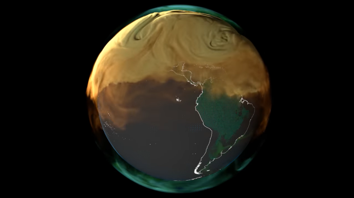
Earth is being choked by a thick, curling fog of carbon dioxide that coats the planet as the months go by, a series of NASA videos shows. The newly released animations visualize the astonishing scale of human carbon dioxide (CO2) emissions over a year by coloring the invisible greenhouse gas.
The animations were produced by NASA's Scientific Visualization Studio and show CO2 emissions, which are cooking the planet, during the year 2021, with contributions from various human and natural sources highlighted in different colors.
Related: Methane 'super-emitters' on Earth spotted by space station experiment

In the animations, emissions from fossil fuel combustion are shown in orange, and those from burning biomass — living or dead vegetation burned to clear land for agriculture or set on fire by lightning, for example — appear in red. Carbon dioxide produced by land ecosystems through plant respiration is depicted in green, and emissions escaping from the oceans are in blue.
The model also shows where CO2 is absorbed by marine and land ecosystems, such as rainforests, via photosynthesis (in the oceans, this is done by algae). Collectively, these natural ecosystems soak up half of human emissions every year and play a vital role in mitigating climate change by periodically acting as carbon "sinks."
"Though the land and oceans are each carbon sinks in a global sense, individual locations can be sources at different times," scientists noted in a NASA statement.
The three videos present the ebb and flow of CO2 across different regions of the world and highlight where the gas is emitted and absorbed over the course of a year.
Get the Space.com Newsletter
Breaking space news, the latest updates on rocket launches, skywatching events and more!
In an animation featuring North and South America, a yellowish-brown cloud representing emissions from fossil fuels and burning biomass gradually builds in the Northern Hemisphere. Even on such a large scale, emissions can be attributed to specific regions.
"Some interesting features include fossil fuel emissions from the northeastern urban corridor that extends from Washington D.C. to Boston in the United States," scientists wrote in the statement.
Small green streaks that show emissions from land ecosystems curl in and out of this cloud during the winter months. That's because plants that absorb CO2 through photosynthesis during the growing season release much of this carbon in the wintertime, according to the statement.
The dotted green surface pulsing across South America depicts the absorption of CO2 by trees, which occurs only during the day. "The fast oscillation over the Amazon rainforest shows the impact of plants absorbing carbon while the sun is shining and then releasing it during nighttime hours," the scientists wrote in the statement.
A second animation covers parts of Asia and Australia. "The most notable feature is fossil fuel emissions from China," the statement said. Australia acts mainly as a carbon sink — as illustrated by flashing, green dots across most of the country — because the relatively sparse population emits less CO2 than its neighbors. Toward the end of the animation, the cloud of fossil fuel emissions from the Northern Hemisphere drifts southward and envelopes Australia too.
What the NASA video doesn't show is that Australia has the world's highest CO2 emissions from coal per person.
The third video highlights Africa, Europe and the Middle East, with the vast majority of fossil fuel emissions produced in Europe and Saudi Arabia. Wispy red clouds hovering over central Africa depict emissions from fires that people light to clear leftover crops, according to the statement.
While CO2 emissions from fossil fuels are the main driver of climate change, fires contribute to global warming by reducing the amount of carbon that land ecosystems will soak up in the future, according to the statement. That's because charred soils lock up less carbon, and because fires diminish the density and size of trees.
This story was originally posted on Live Science.
Join our Space Forums to keep talking space on the latest missions, night sky and more! And if you have a news tip, correction or comment, let us know at: community@space.com.

Sascha is a U.K.-based trainee staff writer at Live Science. She holds a bachelor’s degree in biology from the University of Southampton in England and a master’s degree in science communication from Imperial College London. Her work has appeared in The Guardian and the health website Zoe. Besides writing, she enjoys playing tennis, bread-making and browsing second-hand shops for hidden gems.
-
tjj300 Totally misleading. It makes it look like humans are the yearly major component of plant food worldwide, when we are just a small contributor. BTW, we're near the coldest our global climate has been in the last 12,000 years, worry about actual global threats, like an X100 CME that sets us back to oil lamps and horses, not some fantasy boogieman.Reply -
Unclear Engineer I am getting the impression that these animations are generated by computer models, not straight from satellite measurements. Otherwise, there would not be a way to color-code the CO2 by the type of source, since all CO2 would look the same to a satellite sensor.Reply
So, the question comes to mind: how well do these predicted CO2 concentrations track the CO2 concentrations that are actually measured by the NOAA satellites?


